
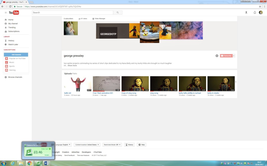
- after creating a YouTube channel
- its was linked to the newly created Facebook page
- and then linked to WordPress account
- by doing this increased the number of viewers from 19 to 907
- this is the most visible evidence of the increase potential for awareness of your own work so far


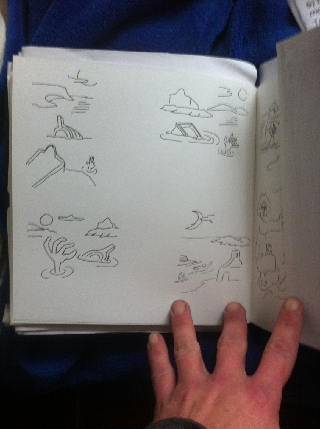
 a rubbing highlights faults or areas that need more work

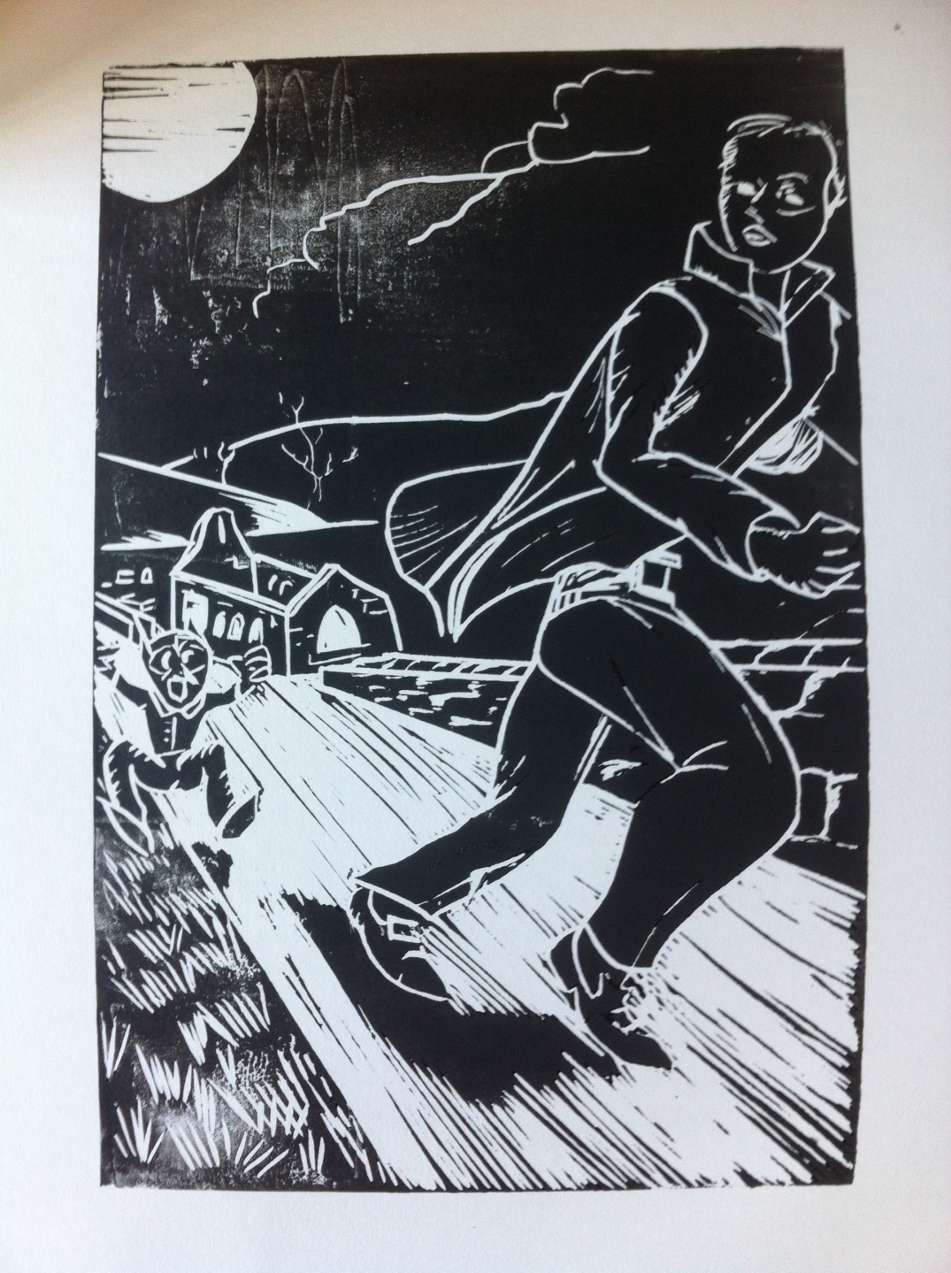 each of the above has been rubbed first to decided where alterations were needed before printing


